Gender-Neutral Product Design

When I was first told that the products I designed were “feminine”, I couldn’t hide my disappointment. For an undergraduate young man in his early twenties, “feminine” didn’t sound exactly like the most flattering compliment to my product’s aesthetics. But in fact, it was.
The giver of said compliment (a man) rushed to clarify that what he was referring to had more to do with a certain delicacy, softness and human touch that he found lacking in most other technical-university-created designs. Needless to say, I am now thankful for those words, not only for what they meant, but for the impact they made in shaping my identity as a future designer.
Talking about identity
As it is neatly outlined in this article, “our gender is only one of many variables that shape our identity”. And marketing departments have long since discovered the power of tapping into that by stereotyping products to “materialise” that identity and, ultimately, sell more.
Setting aside the fact that more and more people don’t feel comfortable with the traditionally binary definition of gender and prefer to remain undefined, the segmentation of men and women’s identities through the products they use is frankly quite regressive and not very healthy. It builds on an oversimplification of our taste, preferences and desires based on our sex. Something that chiefly derives from human-made social gender norms instead of our complex and nuanced nature.
So how can we refrain from propagating gender stereotypes and contribute to a neutral aesthetic free from gender associations, while making sure that products still sell? And how can we develop that neutral, genderless design language while acknowledging the nuances of our human nature? The answer, I believe, is by highlighting what we have in common rather than what differentiates us.
“How can we develop that neutral, genderless design language while acknowledging the nuances of our human nature?”
The beauty and fashion industries, despite their sometimes controversial strategies, have come a long way in this regard. Unisex clothes and accessories are now easier to find, and some brands are proving that “focusing on shared values rather than gender ideals” can be a successful market strategy. But the same cannot be said for other segments, such as homeware products or consumer electronics; the latter case being particularly acute, as most gadgets and electronic devices seem to be primarily targeted towards – and appealing to – men. Or else, painted in purple for the women’s version.

Aesop’s pure, genderless branding
Gender semantics in product design
I am not going to linger on examples of what traditionally makes a product masculine or feminine, for I want this article to focus on the opposite. But it has been crucial for me to identify and understand these gender markers in order to work with and against them. In a nutshell:
Beyond the blue/pink divide (painfully present in toys for children), dark colours are considered more masculine (especially black and blue), whereas lilacs and greens are considered more feminine. Deeper hues are regarded as more masculine as opposed to muted pastel tones.
Metallic looking materials and machine-like details tend to be more geared towards men, whereas soft touch and other nature-like materials and textures appear to be more associated with women.
Edgy, geometrical and technical-looking shapes are considered more masculine (aggressive) than round and wavy ones (gentle).
Floral ornaments and simple patterns are often used to add visual texture to products targeted at women, whereas men’s products tend to have flat or over-detailed surfaces.
Script and other flowing typefaces appear to be more feminine than straight, bold ones.
Tags that ridiculously label products as “only for men” or “only for her” are commonplace and the internet has found some pretty hilarious examples of them.
Towards a genderless aesthetic
If the internet is full of examples of silly gendered products, it is no less full of designers trying to “revert” this tendency by giving opposing visual clues. Like a car-inspired clothes iron or a colourful technological device. But “giving feminine meanings to a masculine identified product does not make the product women oriented” and vice versa. It simply emphasises the stereotypes even more. The idea instead is to blur the boundaries between these binary notions while keeping the products interesting and appealing to a broad audience. But how can we achieve a truly genderless aesthetic? Below are some guidelines I find useful to follow:

The Audi iron. Designerly, but...
Choose neutral colours: beige, greys, pale yellows and greens, as well as other desaturated blues, are good alternatives to heavily stereotyped colours. White is also regarded as a neutral colour, especially on matt finishes as opposed to glossy.
If possible, choose natural materials or those that resemble them. Wood, glass and plant fibers are all better than plastics at speaking to our senses regardless of gender. The same goes for fabrics and other materials with subtle and abstract textures.

Georganics bamboo toothbrush. Available in different colours… so you don’t mix them up.
Apply softer and more fluid lines: they are not more feminine than sharp ones, they are just friendlier. Here the risk lies in the product becoming dull and unattractive. A good mix of round corners and tight lines can convey ease while keeping the tension that is often what makes products aesthetically interesting.

MUJI collection of kitchen appliances. By Naoto Fukasawa
A balanced combination of features that we identify as masculine and feminine: geometrical shapes with a soft-touch finish, traditionally masculine colours but muted tones, as well as the combination of natural and non-natural materials.
Customise the colour accent: giving the users a neutral base on which to add customisable colours among a series of curated choices is a way to keep the product uniform across genders, but personalised enough to appeal to people’s unique sensibilities.
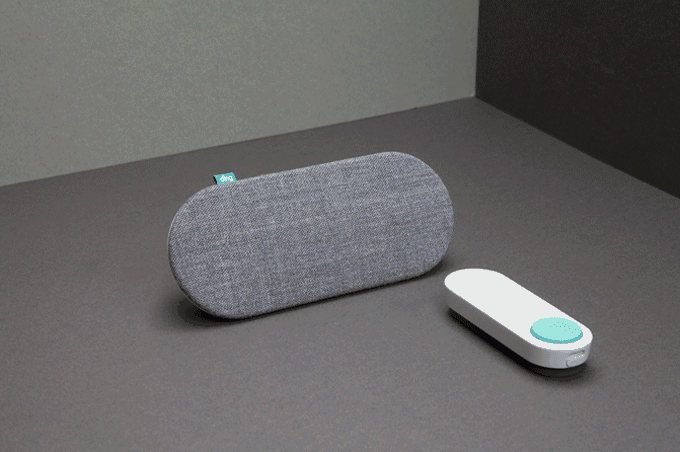
Ome Smart (and gender neutral) doorbell
Simplicity & minimalism. Although the famous design motto “less is more” has been used and misused over and over again, it still rings true. More or less. Whenever we are confronted by products that have been reduced to their aesthetic and functional essence of natural, modest simplicity, their appeal is almost universal.

Watch brands such as Braun and Instrmnt have long ago removed gender from their collections
Interestingly, some of the very same strategies that are outlined here as contributing factors for a genderless design aesthetic also work well when turning a product into a timeless, elegant and sophisticated piece. You get my point.
So how do we handle this at FROLIC studio?
Because a lot of our work comprises providing a service to clients, the amount of freedom we have to touch upon the previous points can be limited. Corporate colours, for instance, are all too often an inseparable part of the products we develop. Sometimes these colours fall into the category of neutral, but that is not always the case - and striking a good balance between brand identity and gender neutrality can then become one of the challenges we face.
Our approach is to keep on cultivating a gender-sensitive design aesthetics. Asking ourselves: is this a heavily gendered design? Can it be otherwise? Is it even important for this context? Sometimes the answer is yes and sometimes the answer is…well, no. If we cannot adjust the colours, we play with the ratio of those colours, tweak the shape, smooth out details…
“Our approach is to keep on cultivating a gender-sensitive design aesthetics. Asking ourselves: is this a heavily gendered design? Can it be otherwise?”
When we work on our own projects, we have complete agency over the direction we want to take with the design. This means we can choose contribution (active, mindful and positive) we make to the wider product landscape. Smartians is our latest self-initiated project and a good example of it. With its cute, technical yet fresh look, this set of motorised actuators is designed to fit into any type of household, regardless of its resident’s gender.
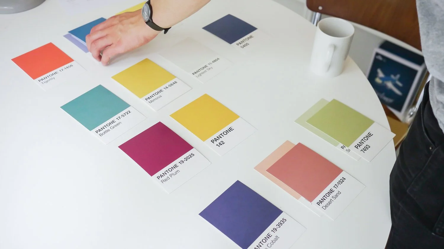
Colour selection process for Smartians

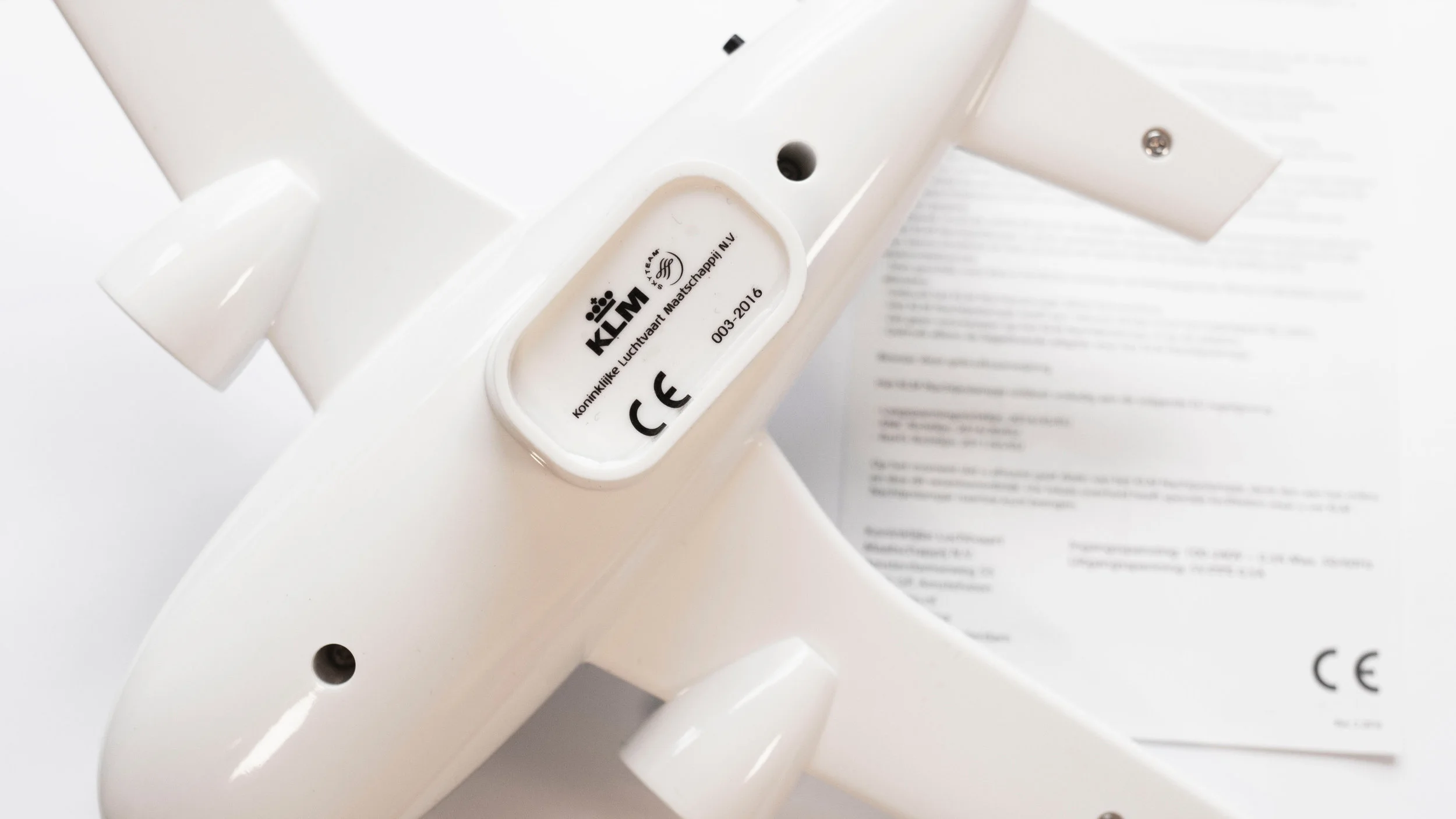
Maybe one day I will tell you about how we were faced with the challenge to design a gender-neutral plane-like toy and lamp, and how we successfully navigated the challenge. For now, though, I’ll keep on honing my feminine product design skills and applying them to what I do. Proudly.
Explore more articles