The 7 principles of Universal Design

Here at the studio, we believe that creating products that are inclusive is a fundamental part of every design, and one way to ensure this is by implementing the principles of Universal Design in the process.
At its core, Universal Design concentrates on designing products for everyone, regardless of age, size or ability - without the need for adaptations.
But before we jump into it, let's have a quick look at the three principal schools of thoughts that focus on extending access and inclusion for products.
Accessibility vs Universal Design vs Inclusive Design
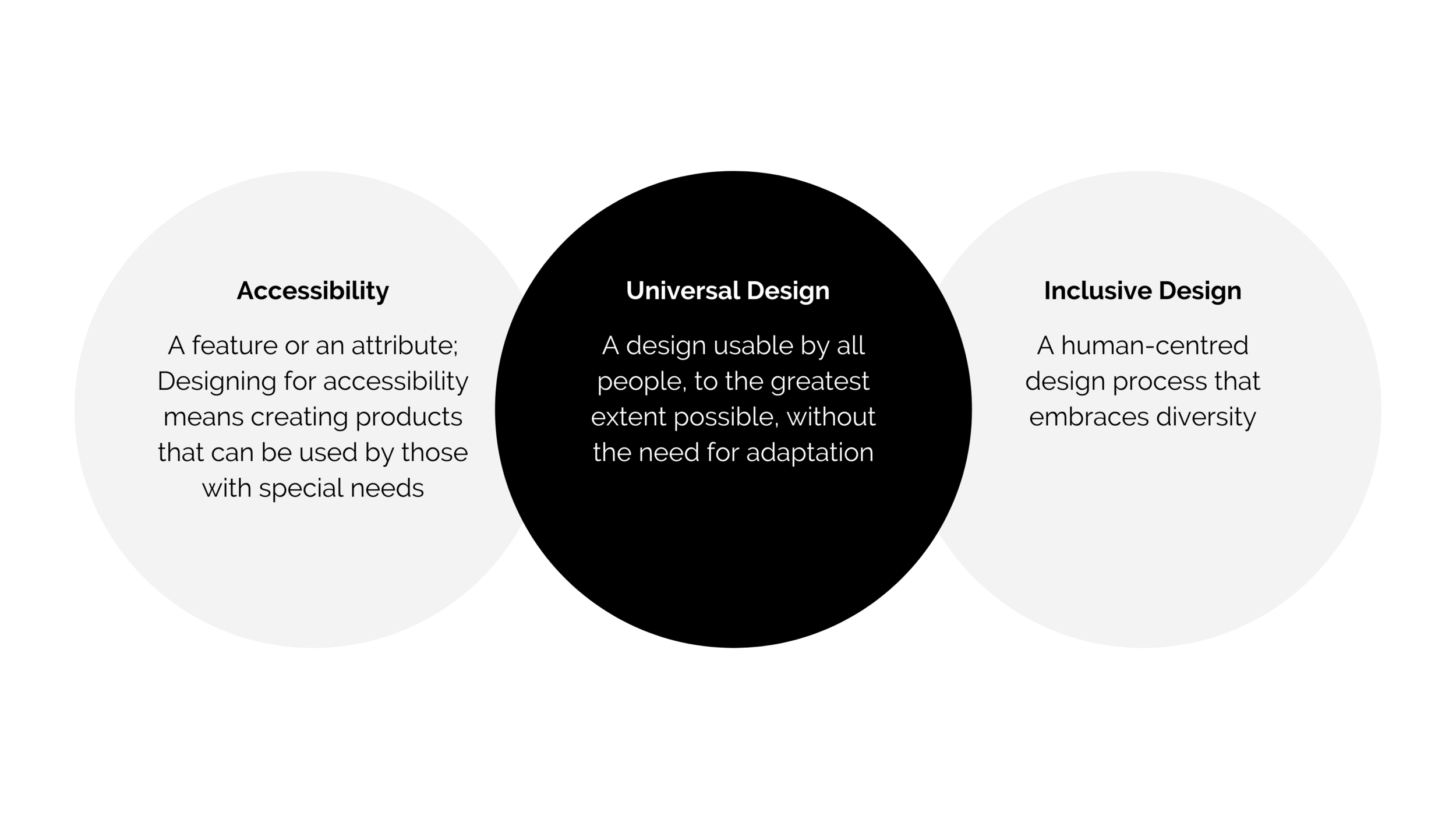
Now that we have an initial overview of the nuances between these terms, we continue to explore the principles of Universal Design.
The seven principles of Universal Design
In 1997, a team from the Center for Universal Design, comprised of architects, designers, engineers, and researchers, elaborated a set of principles covering the fundamentals of Universal Design.
From a product design perspective, we've listed each of them below, along with real-world examples from the field.
Overview:
1- Equitable use
Kicking things off with equitable use, its purpose is to design products that can be used by people with different abilities, making the product's value equal for everyone.

A current example could be Amazon Echo, as the popular smart speaker allows children, adults and elders to benefit from its assistance alike. Additionally, Amazon created a new feature, the Echo Show, where everyone can access it by asking "Alexa, what am I holding?" or a similar phrase that will cue the system to examine an object through the camera.
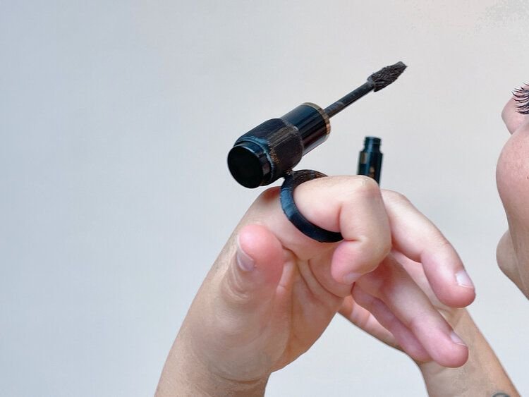
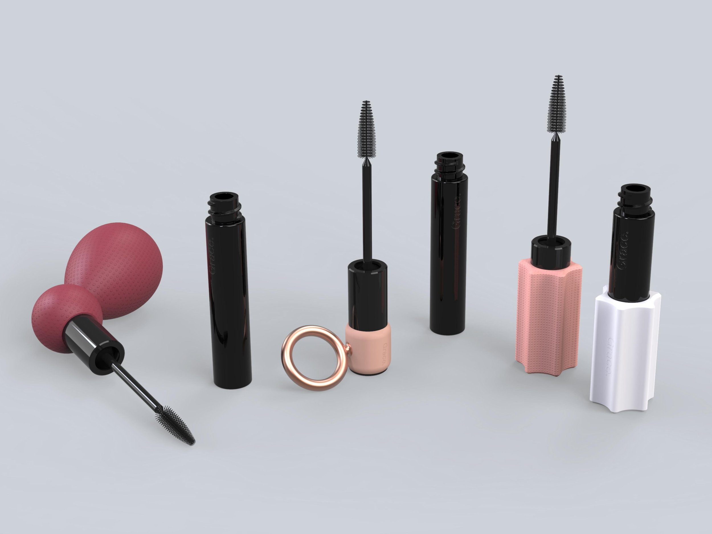
In our case, we created Grace, a series of universal add-ons that make beauty products more accessible and inclusive. We designed together with people with arthritis, tremors, cerebral palsy, and various dexterity challenges during the research phase. Their invaluable input led us to the final result: three grip add-ons for makeup intended to meet every user's physical needs.
2- Flexibility in use
Because people have different needs and preferences - for instance, some are more visual than others or respond better to sound - the second principle was created thinking about designing flexible products that could bring multiple options in their way of use.
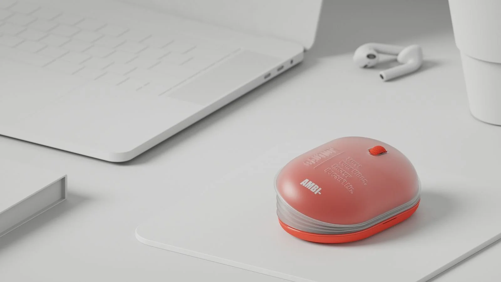
As a case in point, we look at the ergonomic mouse AMBI, designed by Ju Yeon Baek. The mouse features an accordion-style design, which can be altered to accommodate both right- and left-handed users while allowing them to change it according to the size of their hand. This could prevent wrist pain and keep users feeling much more comfortable when working for long periods.
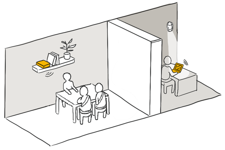
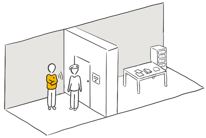
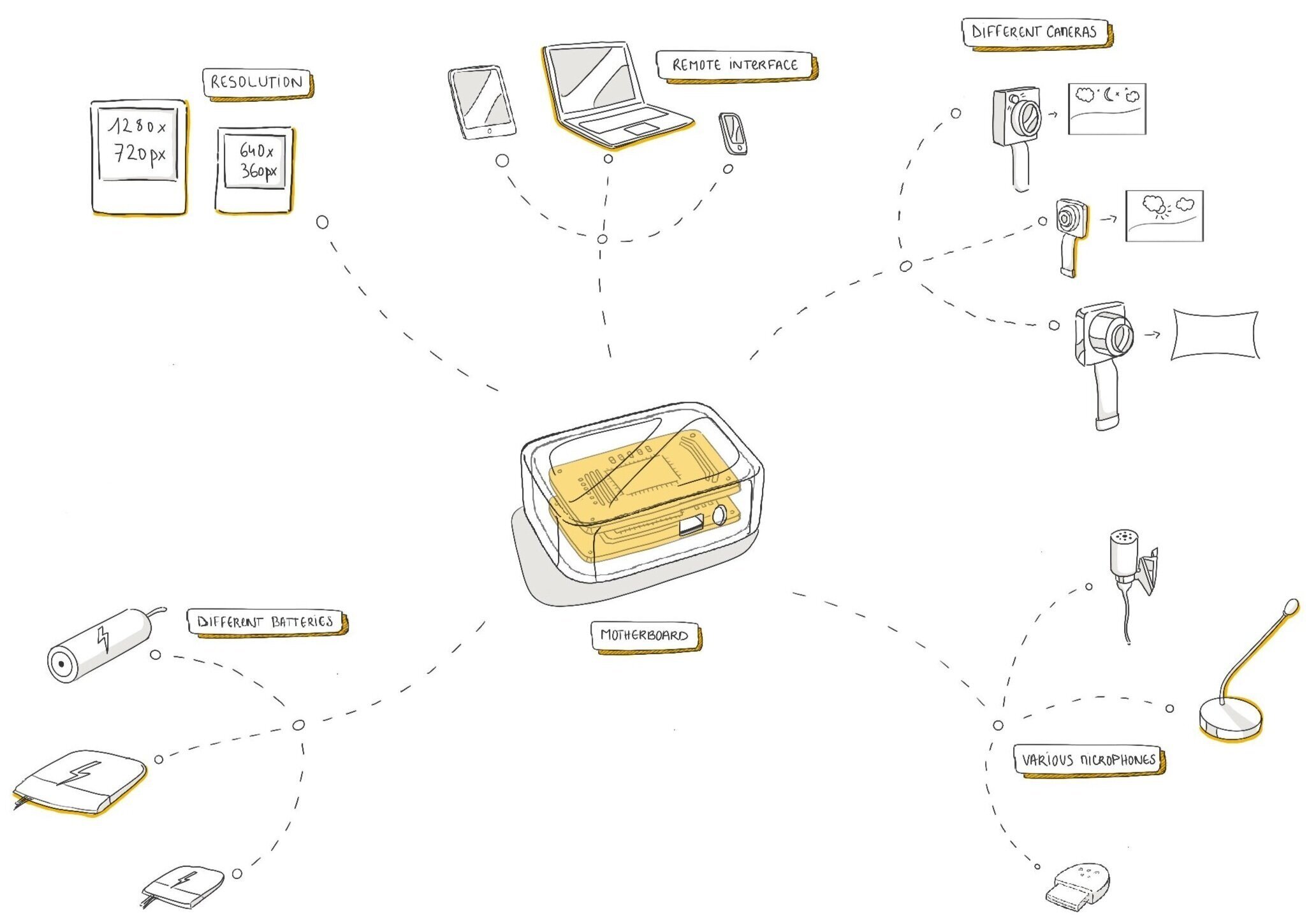
Here, at FROLIC studio, our modular covert camera for documenting human rights abuses was, too, designed to be as adaptable as possible. There are many different scenarios in which this hidden device can be used, so we've designed it to be handled securely in various ways. Its long battery life, for instance, offers an extended battery in situations where the camera is hidden in fixtures and a small battery (plus wide-angle lens) for when it is worn inside a shirt.

3- Simple and intuitive
As suggested by itself, this principle supports that the use of the design must be easy to understand, regardless of the experience, knowledge, command of the language or the current level of concentration of the user.
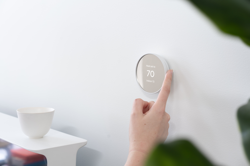
The Google Nest Thermostat could be a good example here. This uncomplicated device has a rotational control that allows users to regulate the settings without being presented with any unnecessary information. Additionally, it possesses a proximity sensor that shows the fitting interface when the user comes closer.
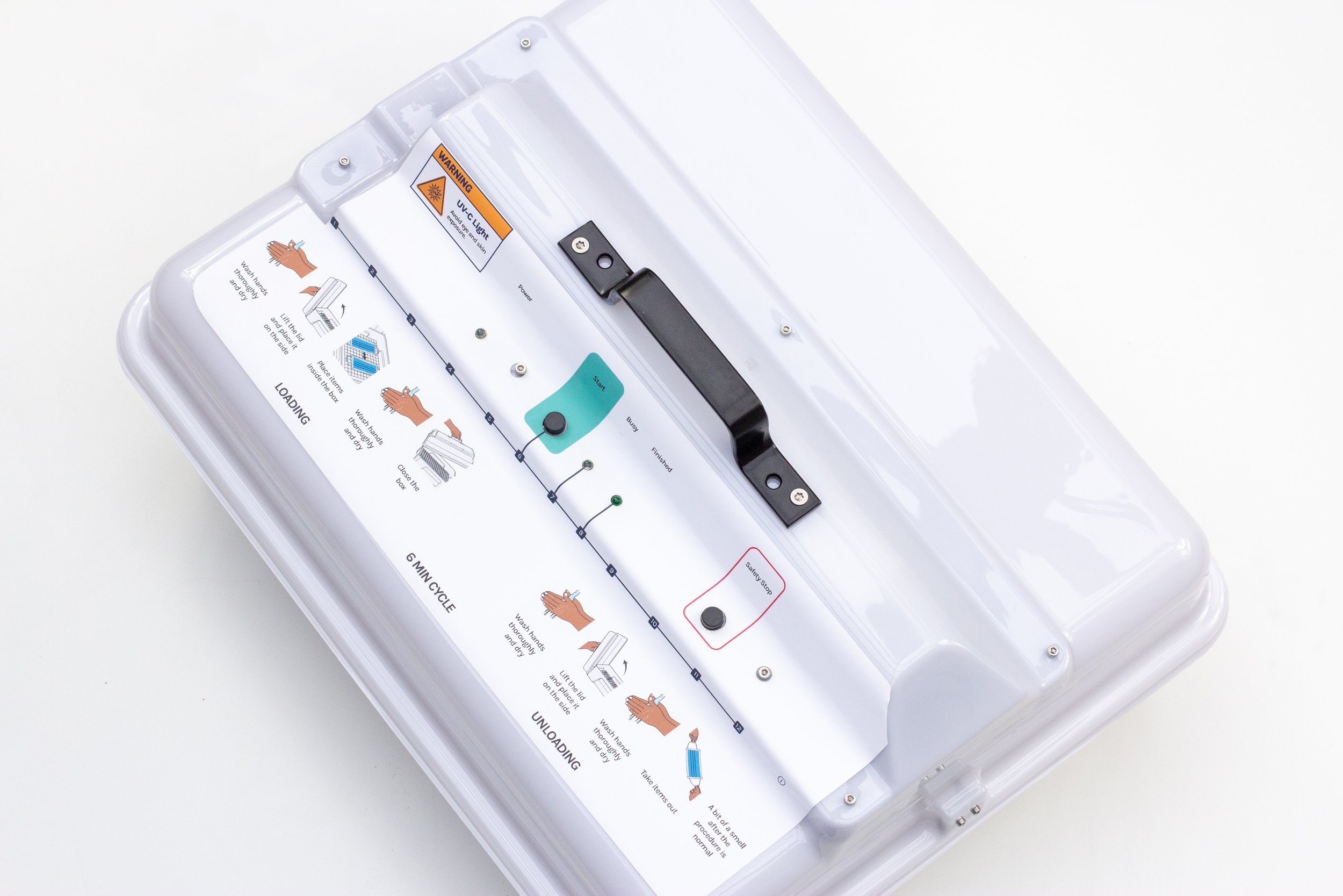
From our own portfolio, we look at the Sandu UVC decontamination boxes that disinfect surgical masks and have recently been implemented in hospitals in Uganda. As the device is used in a high-risk medical context, following the safety protocol is crucial. To ensure proper usage, we created a self-explanatory interface with graphical icons and lighting feedback that guides users through each step of the disinfection procedure in a safe and simple way.
4- Noticeable information
The fourth principle in this list implies that a design must effectively communicate all information to the user, regardless of their sensory abilities or environmental conditions.
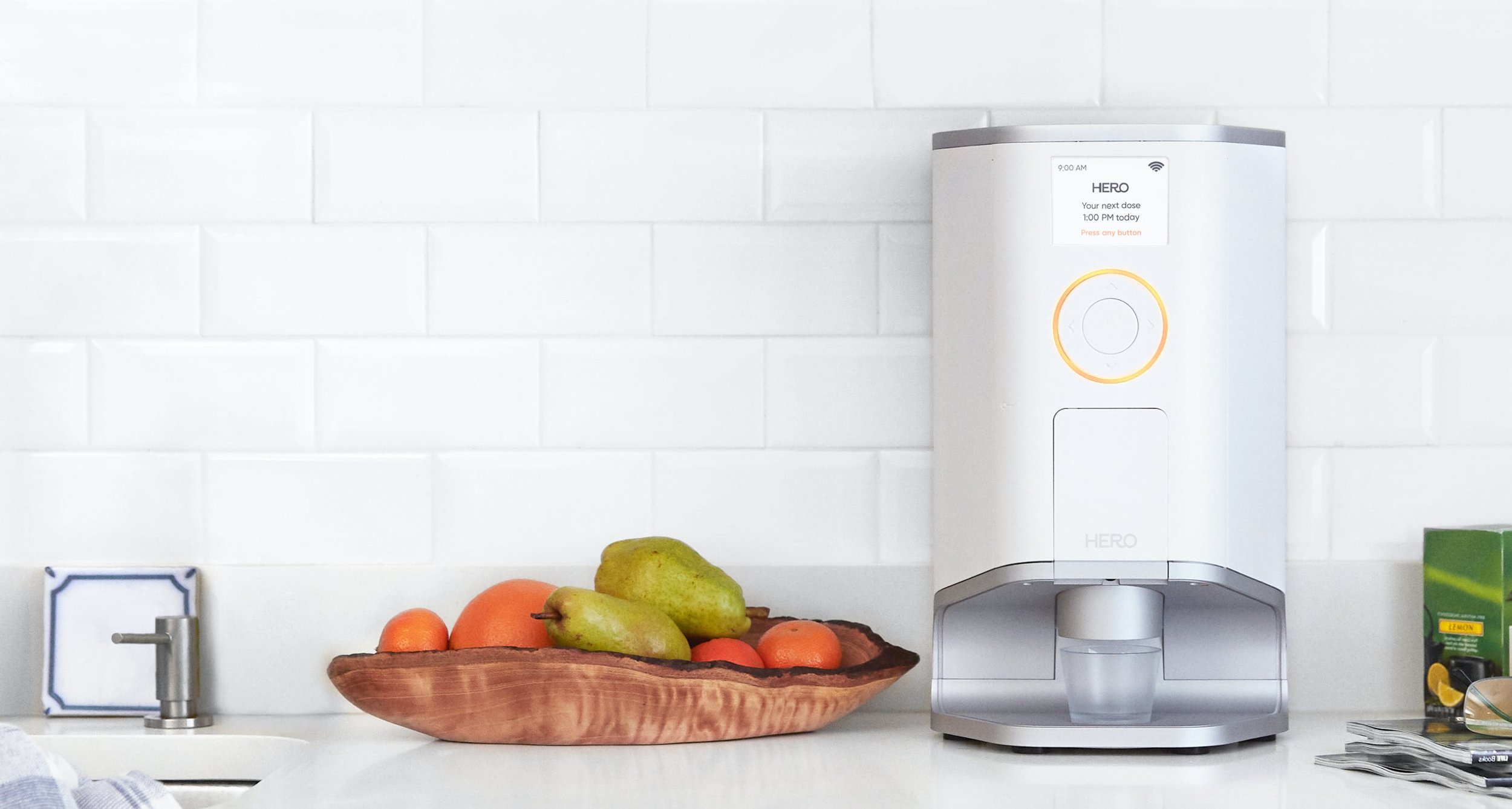
To illustrate, Hero is a high-tech medication manager with app-connected features that helps those who take a variety of medications every day. All it takes is one button press for the device to dispense the exact dose of pills - established beforehand via an accompanying app. As for the notifications, Hero comes with an easy to read interface and, most importantly, it has a clear audible sound and a flashing light for alerts such as when supplies are low.
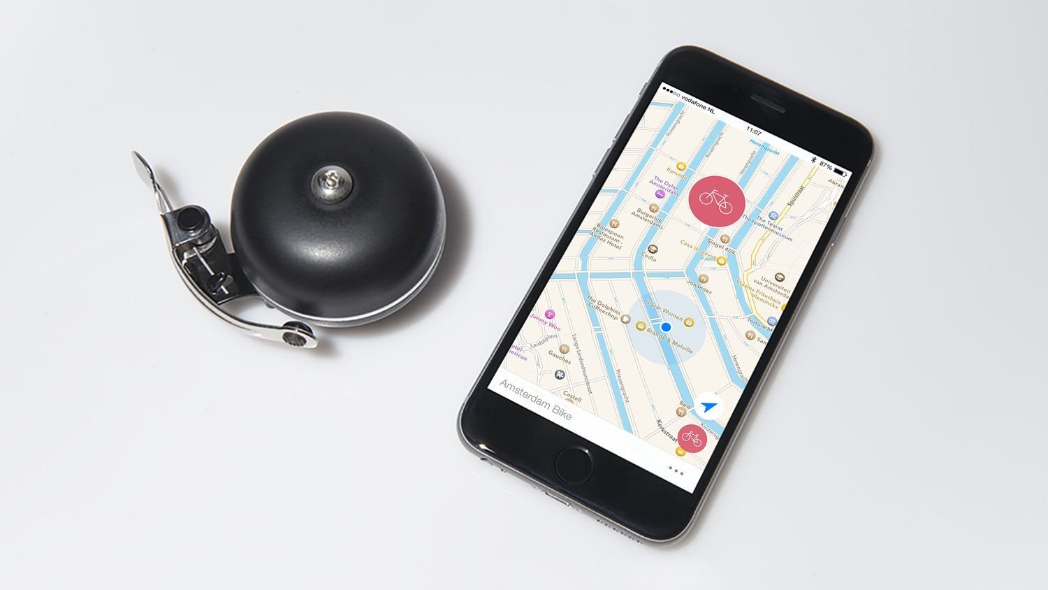
Following the same scheme, we bring up PingBell - a smart bell also with app-connected features that helps users find their bike. With a glance at the map, they can see where the bike was left, and thanks to the use of Bluetooth Low Energy, they can know if they are getting close or not - within meters. The idea here is very simple: as the user approaches the bike, the app switches from a map view (useful when far from the bike) to a 'ring the bell' view (useful when close to the bike and more likely to hear the bell). At night, it is also possible to activate the flashing light of the bell via the app.
5- Tolerance for error
This principle represents the idea that all products must minimize risks and adverse outcomes in case of accidental or unintentional actions and alert the user to this possibility.
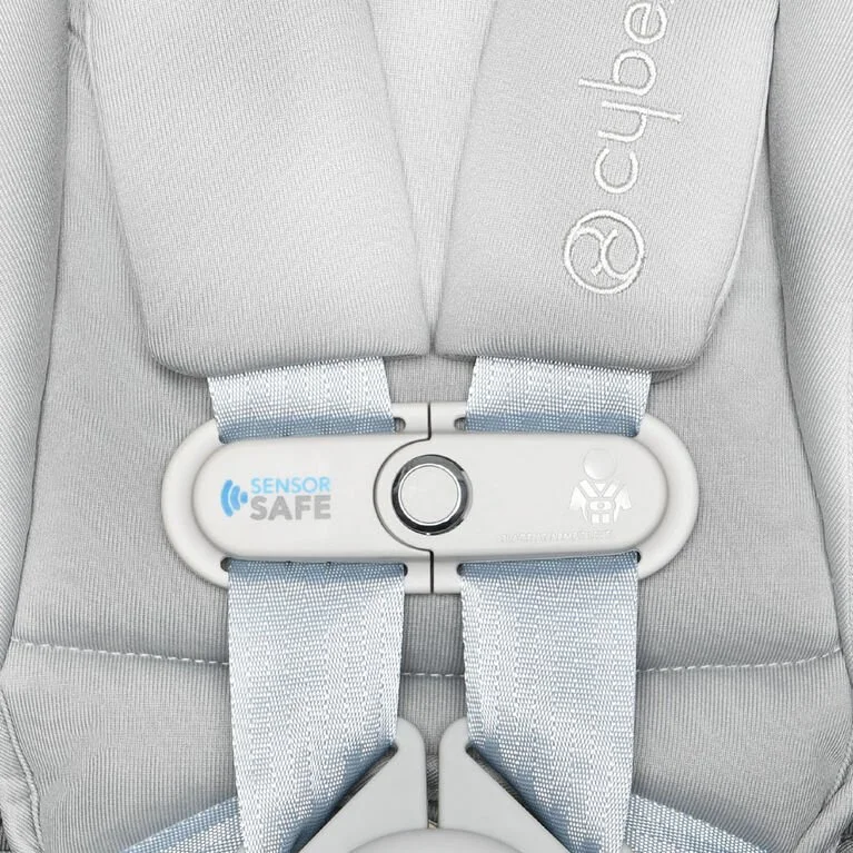
Built into the child's car seat, the SensorSafe clip sends child safety alerts straight to the app on the parent's phone, allowing them to get instant insight into their child's well-being - even when they keep an eye on the road.
For instance, the device notifies you if the child has broken free from their chest clip while the car is in motion or if the child was left alone and buckled in. In addition, it is even possible to configure the app to alert emergency contacts and share the child's location.
For us, an example that we can highlight is Smartians, cloud-connected motors that make household devices smarter, such as adjusting thermostats and opening and closing curtains. Due to its versatility, the options for use are endless and led us to consider error tolerance throughout the entire process; The grid of snap-fits, for example, can be easily adjusted anywhere without the user needing to be very precise on the initial installation.

6- Low physical effort
The sixth principle of this list implies that every product should be used efficiently and comfortably with minimal fatigue, maintaining a neutral body posture, avoiding repetitions and excessive physical effort.
A good example would be the Ikea ThisAbles project, a set of inclusive add-ons to make daily tasks less challenging for everyone. Bigger light switches, easier-to-grab handles and extenders for couch legs are among the designs produced so far.
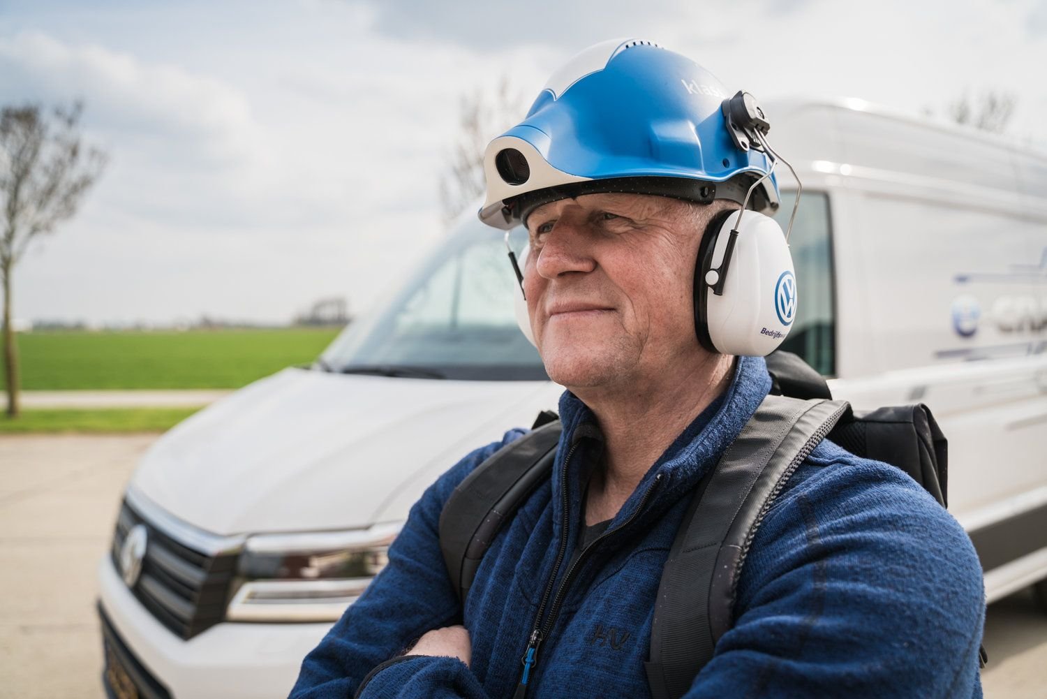
From our side, we add the Volkswagen helmet – a hands-free video streamer created to provide on-site knowledge (directly from the worker's perspective) to students through a remote live session. The camera streams directly through an open-source broadcast software, and there is also an audio feed that gives the professional the questions from the students.
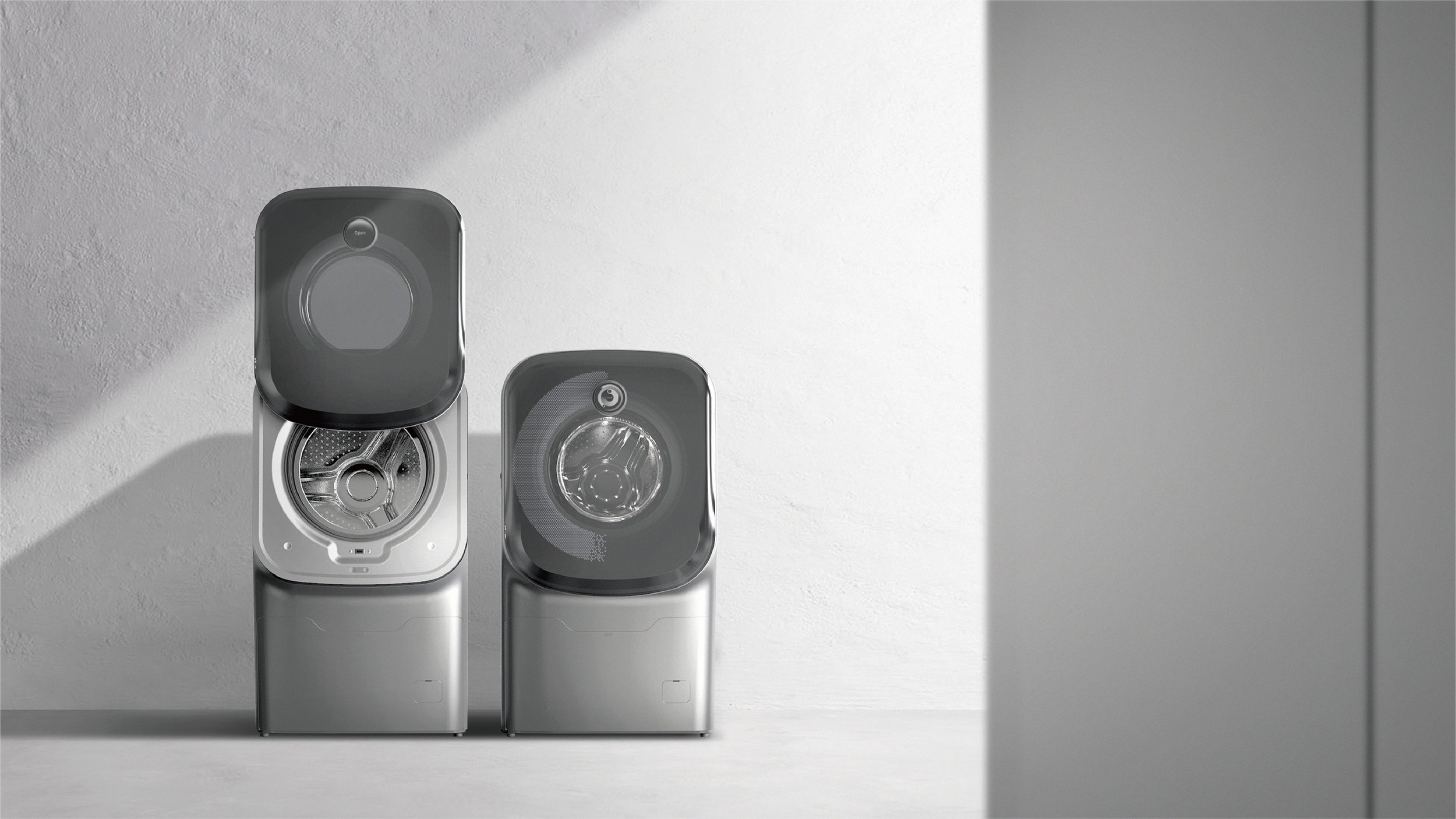
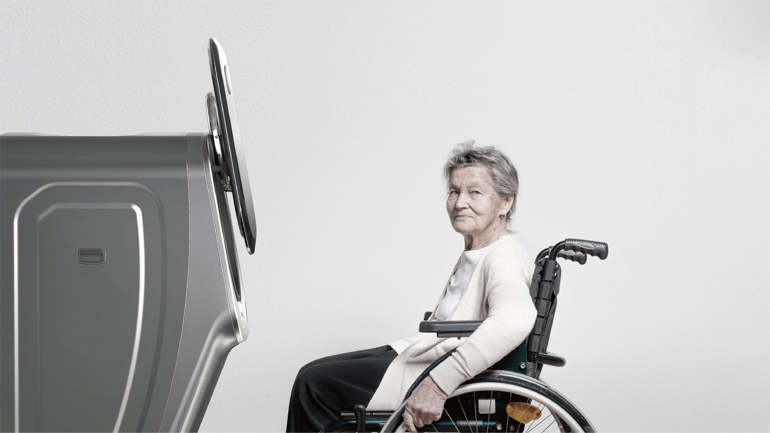
7- Size (and space) for approach and use
From an industrial design perspective, this last principle states that every design must allow for adequate size, form and ergonomics to approach, reach, manipulate and use, regardless of the user's size, posture and ability.
The SLIP WASH designed by Jiheon Song serves as a good example here. The usual washing machine takes up more space with the front opening door and makes it more difficult for the user to navigate around it, especially for those with a wheelchair. Considering size and space, the SLIP WASH door slides up, and the wash container is at the front, making the area less restrictive and reducing the manoeuvres and bends that the user would generally have to do.
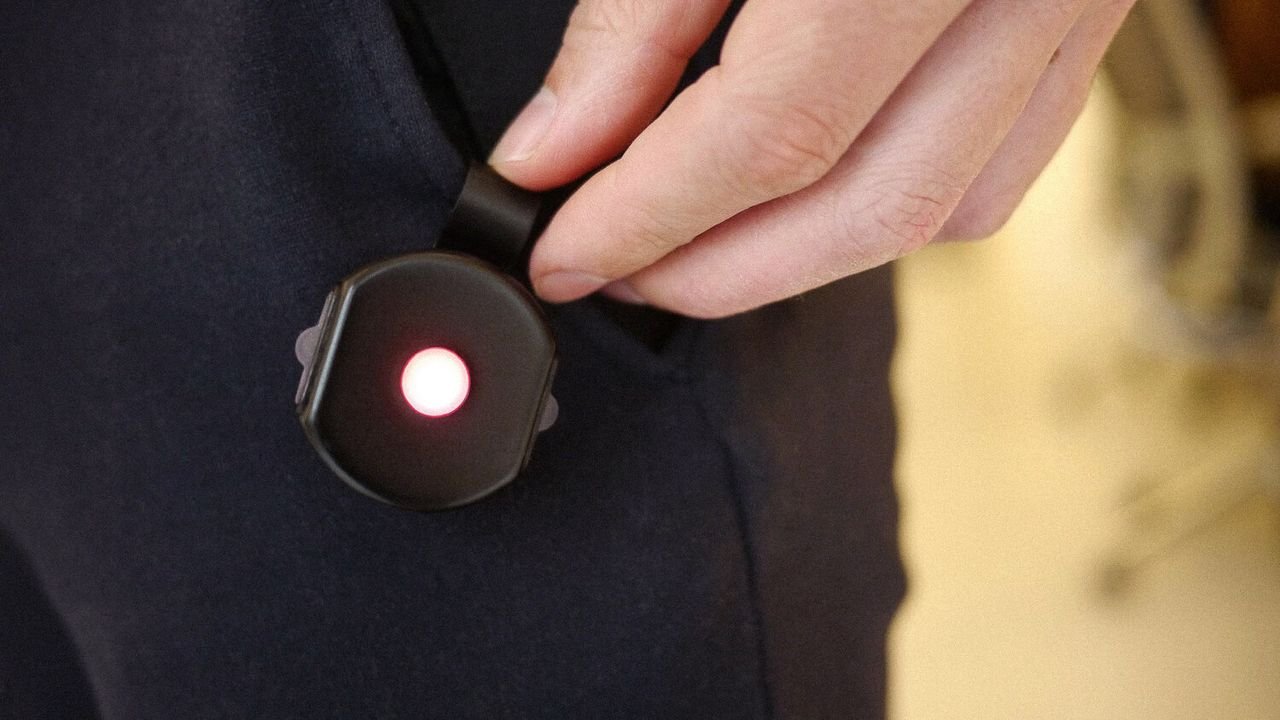
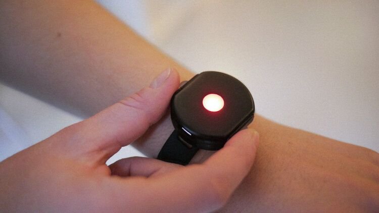
Another good fit is our wearable alarm. This small device has different types of attachments and can be worn on the wrist, a key card or hung from a belt loop - making it suitable for the various needs and preferences of the individual.
Conclusion
Creating universal products requires additional thought and planning. It's much easier, however, to plan for it early on than to try to retrofit an inaccessible product in order to make it accessible.
Universal Design encourages us to go beyond accessibility, defending a design-for-all approach that aims to meet the needs of people of all abilities, ages, genders, cultural and socioeconomic backgrounds.
In the end, Universal Design is about applying intelligent and innovative design strategies to develop flexible, usable and intuitive products for everyone.
Explore more articles